Johnson’s Baby Redesign
Johnson’s Baby first made its debut in 1893 and has been a staple in households ever since. However, moms around the world were looking easy to use products with fewer and more simple ingredients. Our intent was to modernize an iconic brand—from the formula to the bottle to the label, everything has been re-imagined. We developed a system that would work across 100+ products, in various sizes, in single and multiple language layouts across the globe. Our design simplifies pack communication to communicate the new gentler formulas with fewer ingredients. We improved navigation on shelf by introducing a tiering system based on "ages and stages". Classic baby products for all ages remain simple and iconic, while custom illustrated icons and characters help to telegraphically communicate products for newborns, bedtime, and toddler needs. Our extensive color work helped reduce global production complexity by harmonizing 400+ colors down to 40 colors.
Under the design direction of Jennifer Dahl, I collaborated with a large team that consisted of graphic designers, industrial designs, package engineers, research & development, marketing, and many more.
To see more technical & strategy work please email [hello.annacallaway@gmail.com] for access to the private page.
Branding, Color Strategy & Color Matching, Dieline Optimization, Global Templates & Design Intents, & Custom Illustrations


Structure & COlor strategy
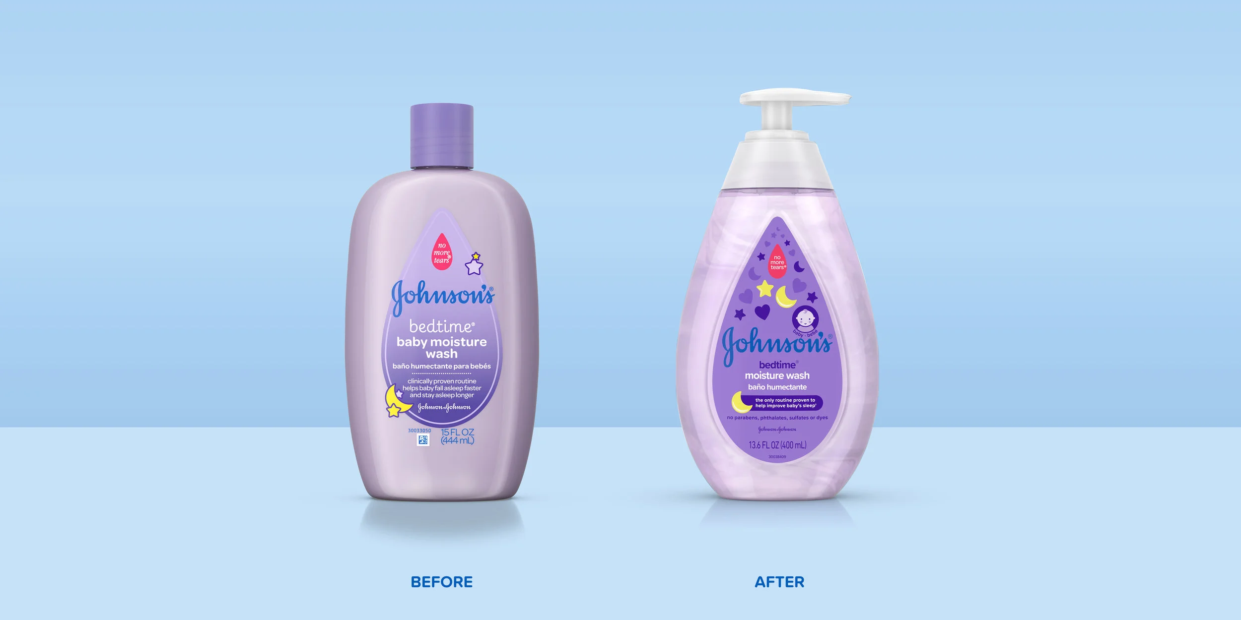
Before the restage there was a lot of inconsistencies across the global portfolio. The same products looked different in different regions, and the same family of products were using many different structure colors. The first thing that needed to happen was to evaluate the entire global portfolio. After we knew what products we had in every region, we began to create a color strategy to simplify and unify the brand. Johnson’s Baby started with around 400 different colors, after the restage there is now around 40. Along with harmonizing the global color strategy, the structures were also redesigned to bring the Johnson’s equity to life in a teardrop shape. As well as reducing the number of dielines to simplify the production process.


Illustration strategy
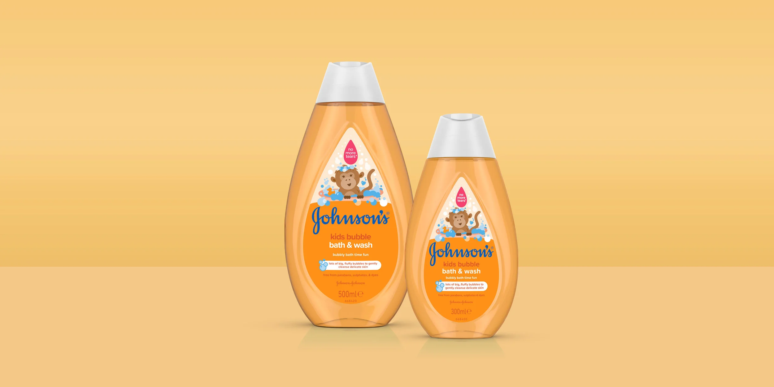
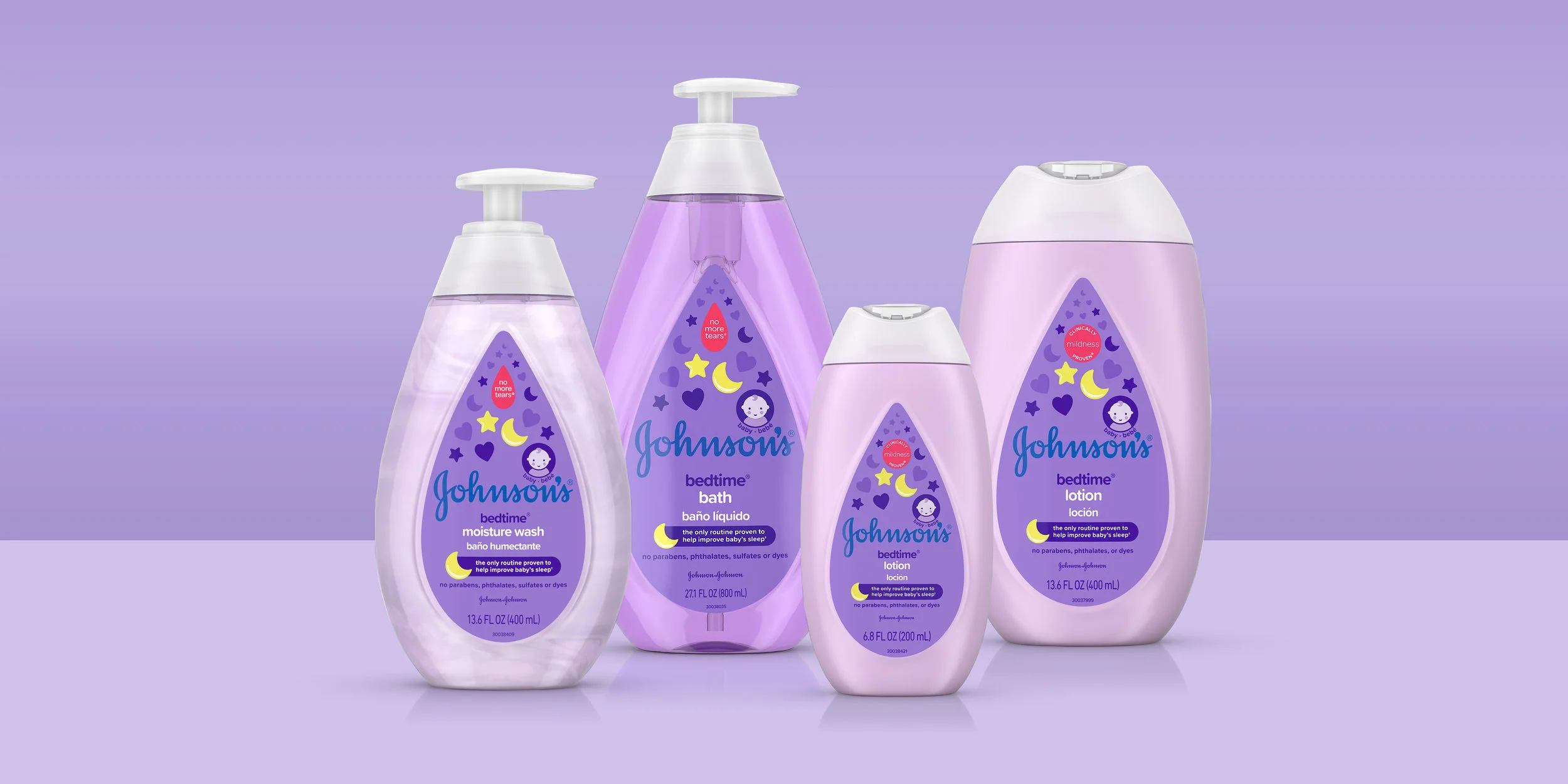
For the Johnson’s redesign, we recognized the power of our iconic teardrop shape and made it the hero of the new packaging. The teardrop shape guided our new bottle design and inspired our illustration direction. Johnson’s champions the bond between baby and parent, and we developed a heart icon from two teardrops to represent this message. Every illustration is based on these two shapes, and every product uses the teardrop and has a heart incorporated into the illustration. Our new illustration style is bold, iconic, and simple, but also soft with rounded edges reflecting a new strategy on simple formulas with fewer ingredients while remaining gentle for baby’s sensitive skin. The illustrations grow and become more complex along with the ages and stages of your baby. The classic baby products used by all ages have a simple hugging heart illustrations reinforcing the mom and baby connection and the heritage of the brand. Johnson’s newborn products have simple monochromatic icons, while “Active Baby” products for 6+ months have slightly more detailed icons with a pop of color. The toddler product range consists of fun, playful characters for 18+ months illustrated in brighter jewel toned colors. All the icons and the characters are illustrated to highlight the ingredients and benefits of each product.